Dashboard

Inside the Dashboard desktop, at the top is the menu shown in the image below:

On the left side of the menu are the Name and the Description of the Dashboard. Also, there is a calendar to select the desired period time to display the data.
The resolution (By Day/By Hour) is the range that changes automatically after selecting the desired period time, i.e. if the selection value is last 7 days, the resolution will not be displayed. The resolution option is not visible if a period longer than one day is selected.
Click on the edit button displays the settings button within the Widget, which allows you to edit the Widget or remove it from the Dashboard.

The refresh button is used to refresh the data displayed inside the Widgets.
Selecting the settings icon in the upper right corner opens a drop-down menu that offers options:
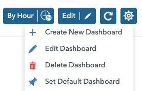
- Create New Dashboard
- Edit Dashboard
- Delete Dashboard
- Set Default Dashboard
Dashboard can be set as default, in which case it will be displayed immediately after clicking on Dashboard tab in the sidebar menu. You can make this change by selecting the Set Default Dashboard option.
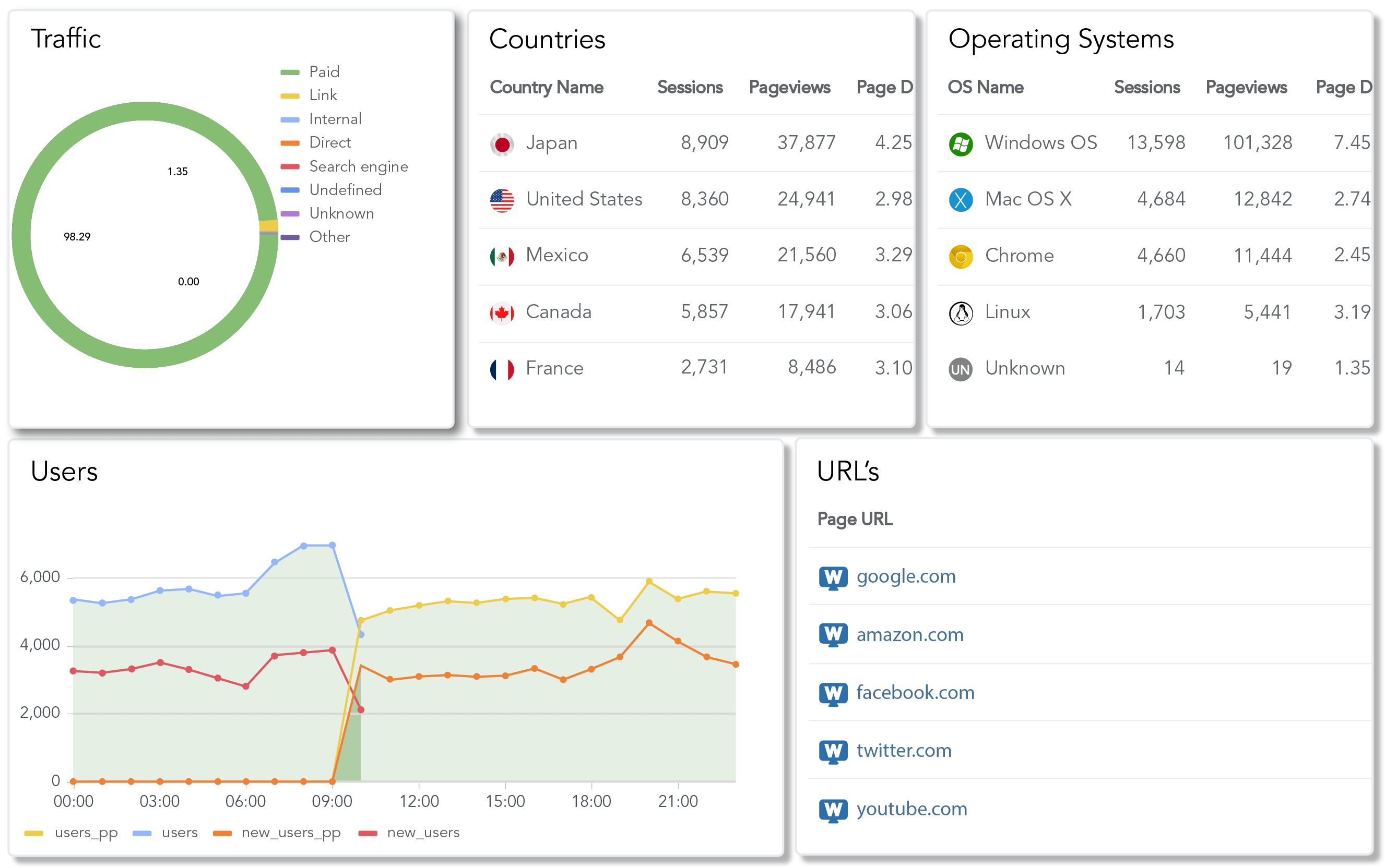
Also, in addition to the mentioned options, it is possible to select the existing Dashboard from the drop-down menu.
Create New Dashboard
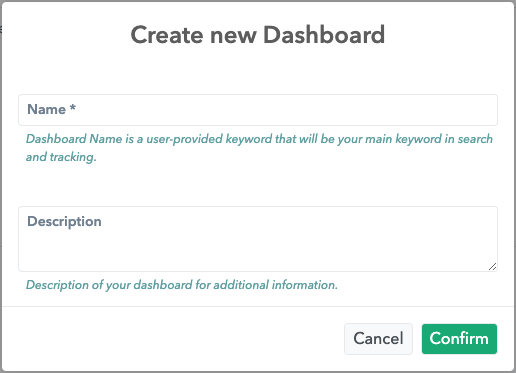
If the Create New Dashboard option is selected, a module opens in which it is necessary to fill in the data on the Dashboard, i.e. Name and Description.The Name field is required.The Description field isn’t required, but in the case of adding a description, a length between 5 and 1000 characters is acceptable.
Edit Dashboard
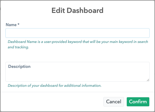
If you select the Edit Dashboard option, a module opens in which it is possible to change the data on the Dashboard, i.e. Name and Description, with the same character limit as when creating a new Dashboard.
Delete Dashboard
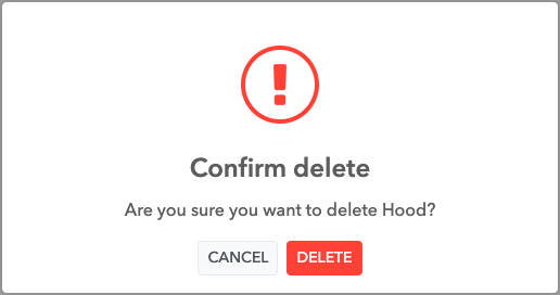
If the Delete Dashboard option is selected, a pop-up opens in which it is necessary to confirm that you want to delete the Dashboard.
Add widgets to Dashboard
If the Create New Dashboard option is selected, a module opens in which it is necessary to fill in the data on the Dashboard, i.e. Name and Description. Clicking the Confirm button in the newly created Dashboard opens a modal with existing widgets with the option to add them or create new ones. You can search for the desired widgets within the module using the Search option.
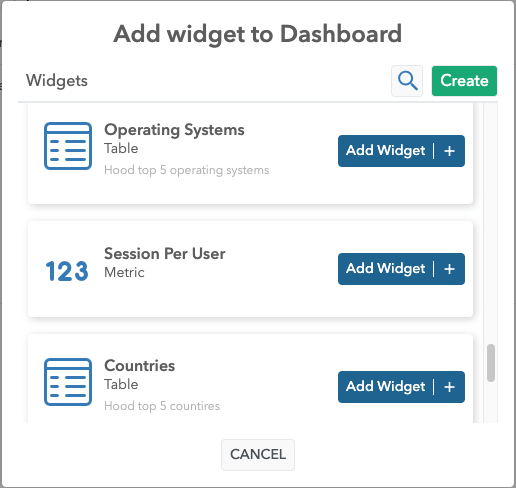
After selecting the desired Widget, it will be displayed on the Dashboard (Add Widget +).
By clicking on the Create button, it is possible to create a custom widget. A modal opens, and it is required to fill in the Name of the Widget and add at least one Field.
Note: The difference between custom and system widgets is that the custom widgets can be edited.
Widget Types
It is possible to choose how the Widget data will be displayed on the Dashboard.
The options for widget types are Table, Metric, Timeline, World Map and Pie.
Depending on the choice of widget type, different fields need to be filled in.
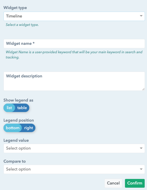
Timeline
Show legend as is used to display data in a list or in a table form.
Legend position is used to show the legend data at the bottom, or the right side of the graph.
Legend value presents additional options for a more detailed display and data comparison. The possibilities are Min, Max, Average, Total.
Compare to gives you the ability to select the period you want to consider and compare it to the chosen period in the calendar. The options are Previous period and Previous week.
Metric
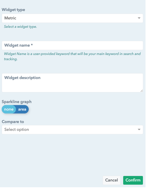
The Sparkline graph is an additional visual display. Options are None and Area.
Compare to gives you the ability to select the period you want to consider and compare it to the chosen period in the calendar. The options are Previous period and Previous week.
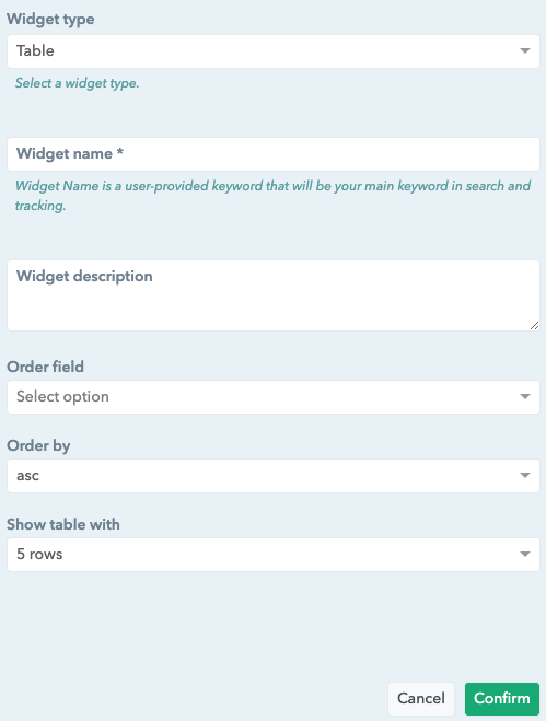
Table
The Order field option allows you to sort the data by the selected field in the table.
The Order by option allows you to select how to sort the data in the table. The options are: asc or desc.
Show table with allows you to select the number of rows to be displayed. Options are 5 rows or 10 rows.
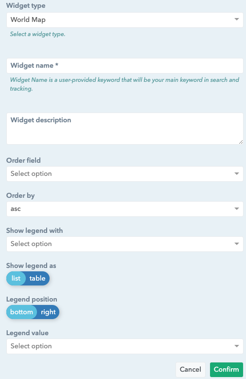
World Map
The Order field option allows you to sort the data by the selected field in the table.
The Order by option allows you to select how to sort the data in the table. The options are: asc or desc
Show legend with allows you to select the number of rows to be displayed. Options are 5 rows or 10 rows.
Show legend as is used to display data in a list or in a table form.
Legend position is used to position the legend data in relation to the position graph that can be selected: bottom or right.
Legend value is used to select the data display mode. The options are Percent and Value.
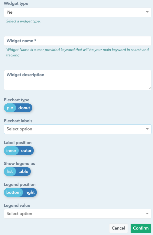
Pie
Piechart type is used to display data as pie or donut.
Piechart labels is used to display data based on Value, Percent and Name.
Label position is used to show the data inner or outer the pie/donut.
Show legend as is used to display data in a list or in a table form.
Legend position is used to position the legend data in relation to the position pie that can be selected: bottom or right.
Legend value is used to select the data display mode. The options are Percent and Value.
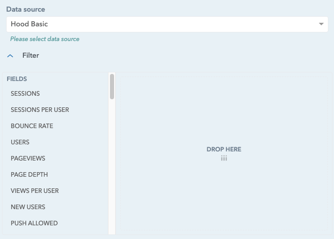
Data source and filter options
Depending on which Data source you select the different data will be shown in the fields section.
In addition to the Data source, there is a filter option that provides the possibility of more detailed filtering of the desired data and works using drag&drop just like within the Designer Report.
Note: After making changes on the Dashboard, it is necessary to confirm the Save option.
