Message Templates

You can send a custom message to one specific user or choose one of the pre-made messages in the form of templates made in this tab.
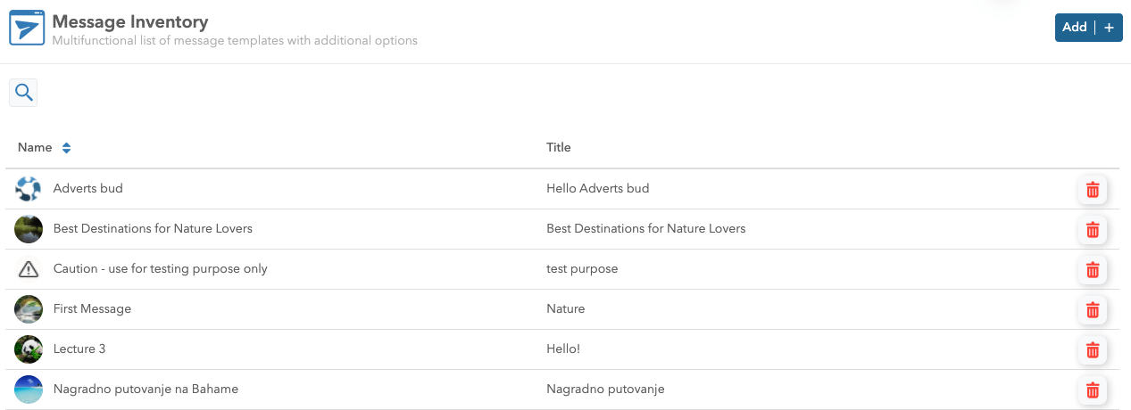
Once you click on the Message templates you will see a multifunctional list of message templates with additional options. The pre-made message templates can later be selected for sending.
Create a Message Template
Please follow this step by step guide for creating messages:
1. Open the Message templates tab and click on the Add button in the upper right corner.
2. First, think of the name of your message. It should be something meaningful and easy to remember, as it will be later on used in search and tracking.
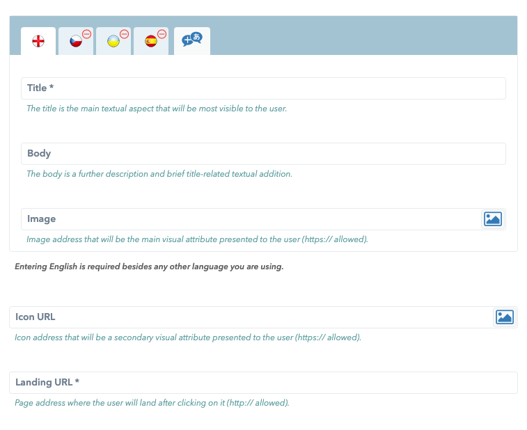
3. When it comes to the Ocamba platform itself, the push notification can contain the following elements:
- Title - the main textual aspect that will be the most visible to the user,
- Body - a further description and bride title-related textual addition (i.e. notification content),
- Image - image address that will be the main visual attribute presented to the user (HTTPS:// is allowed),
- Icon URL - a secondary visual attribute presented to the user (HTTPS:// is allowed),
- Landing URL - page address where the user will land after a click on it (HTTPS:// is allowed),
- Up to two Action buttons and
- Notification options.
Note: For the Image and Icon URL you can select a pre-saved image from the Media Library clicking on the icon next to the input field.
In the Ocamba platform, every message you create is by default created in the English language.
Note: Entering an English language message is required no matter what other language you are using. If you would like to insert additional languages, simply click on the card next to the card with the English flag.
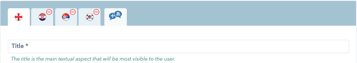
Note: Ocamba currently supports over 30 languages to which you can translate your messages.
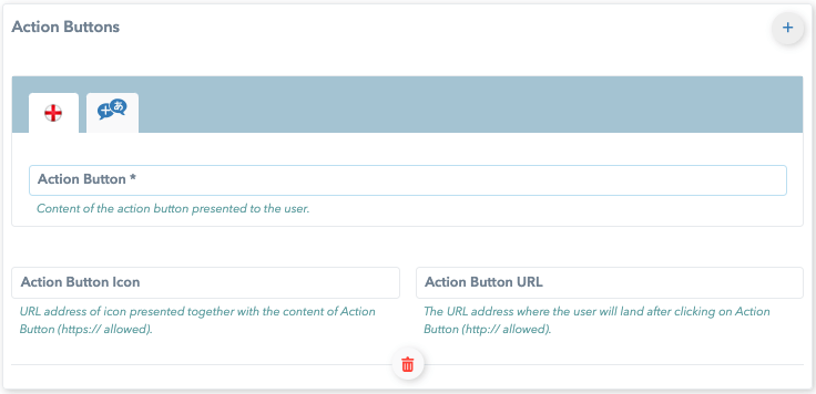
Action buttons
Use action buttons in order to allow recipients to take action on the messages they receive.
A maximum of 2 action buttons can be shown.
The components of Action buttons are:
- Action button - content of the button that is presented to the user,
- Action button icon - the URL address of the icon that is presented together with the content of the action button (HTTPS:// is allowed) and
- Action button URL - the URL address where the user will land after clicking on the action button (HTTPS:// is allowed).
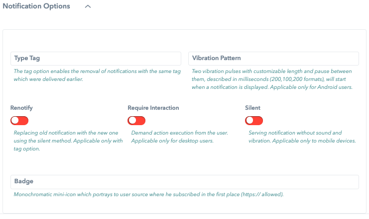
Notification options
Notification options are optional items you can add to your push notification.
The options for push notifications are:
1. Type tag - one of the categories from IAB 2.5,
2. Vibration pattern - a parameter related to the vibrations that will occur after receiving a push notification. It is expressed in milliseconds in the following way vibration-pause-vibration.
3. Renotify - by which we change an outdated notification whose time is no longer relevant with fresh information and all that in a silent method (on/off principle).
4. Require interaction - if this option is enabled, after sending notification users have to act (i.e. click on one of the CTA buttons). It is available for desktop users only.
5. Silent - also an on/off option, which sends a notification to the user without waking the screen, making a sound and vibration. Applies to mobile users only.
6. Badge - monochromatic mini-icon (HTTPS:// is allowed). Most often, it is used to show from which application comes notification.
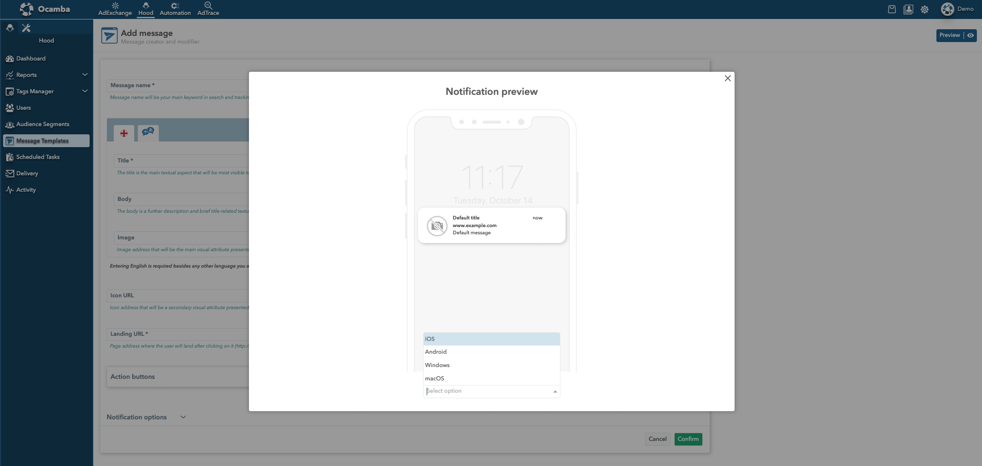
Message Template preview option
While creating Message Template it is possible to preview the notification by clicking the Preview button in the upper right corner. You can choose to preview it for iOS, Android, Windows, and MacOS. It is also possible to preview existing message templates.