Quick feedback
Quick feedback modals (also known as Helpful modals) allow you to collect instant user satisfaction with simple like/dislike buttons embedded in your message or UI. They provide a lightweight way to gather user feedback without requiring extensive forms or detailed responses.
Key features of Quick feedback modals:
- Simple interaction — Users can quickly provide feedback with just a like or dislike button click
- Minimal friction — No forms or lengthy responses required, making it easy for users to share their satisfaction
- Embedded design — Can be embedded directly in your message or UI for seamless integration
- Instant satisfaction collection — Gather real-time user satisfaction on content, features, or experiences
- Quick insights — Get immediate insights into user satisfaction and preferences
- Customizable triggers — Display quick feedback options at strategic moments in the user journey
- Analytics integration — Track user satisfaction trends and responses over time
Common use cases for Quick feedback modals:
- Content feedback — Collect instant feedback on articles, blog posts, or content pieces
- Feature satisfaction — Quickly measure user satisfaction with new features or updates
- Message engagement — Get immediate feedback on notifications or messages
- Product feedback — Allow users to quickly rate products, services, or experiences
- Helpful content — Let users indicate if content was helpful with a simple thumbs up/down
- User experience — Gather quick user satisfaction on overall user experience without interrupting the flow
Step-by-step guide: Creating your Quick feedback modal
Follow this complete guide to create, customize, and track your Quick feedback modal from start to finish.
Step 1: Create your Quick feedback modal
- Navigate to Sites setup in the HoodEngage dashboard
- Go to the Modals & Forms tab
- Click Add Modal
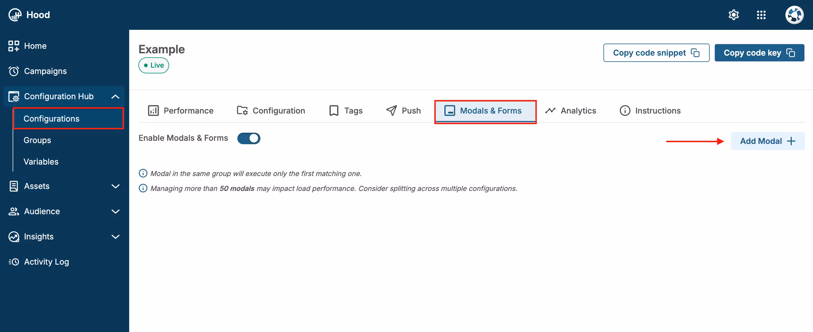
Add Modal
- Choose to either:
- Create Template — Build a custom quick feedback. When you select “Create Template”, Studio will open. Within Studio, you can add text, buttons, and other elements to design your Quick feedback modal.
- Use an existing template — Select from templates if you have previously created them
Step 2: Configure content and design
- Select the Helpful element — Within Studio, select the Helpful element, which you can then style and configure
- Customize the design:
- Choose colors that match your brand
- Add your logo or branding elements
- Adjust button styles (like/dislike, thumbs up/down)
- Configure button placement and size
- Set button labels — Customize the text on like/dislike buttons
- Preview your modal — Use the preview feature to see how it will appear to users
Step 3: Set up triggers and display conditions
Configure when and where your Quick feedback modal should appear. For detailed information about all available activation triggers and render conditions, see Triggers, Conditions, Frequency & Limits.
Step 4: Configure frequency and limits
Set how often your Quick feedback modal should be displayed to users. For detailed information about frequency options and limits, see Triggers, Conditions, Frequency & Limits.
Step 5: Activate and test
- Save your modal — Click Save to store your configuration
- Assign to configuration — Ensure the modal is assigned to the correct configuration
- Test the modal:
- Visit your website
- Trigger the modal based on your settings
- Verify the display and button functionality
- Test on both desktop and mobile devices
- Ensure feedback is being recorded
Step 6: Monitor feedback and analytics
Once your Quick feedback modal is live, track its performance:
View feedback data:
- Navigate to Insights → Feedback
- Find your Quick feedback modal in the list
- View metrics: Total views, Like count, Dislike count, Response rate
Analyze user satisfaction trends:
- Track like/dislike ratios over time
- Identify which content or features receive positive vs. negative feedback
- Monitor response rates to gauge engagement
Export data:
- Export feedback in CSV or JSON format
- All exported files are available in Insights → Exports
- Download for further analysis in external tools
- Access individual feedback responses
Value for users
When users interact with your Quick feedback modal, they receive:
- Quick and easy way to share opinions — Minimal effort required to provide feedback
- Influence on content quality — Their feedback helps improve content and features
- Better user experience — Their input contributes to a more tailored experience
- Recognition — Their voice is heard and valued
Best practices
- Place strategically — Show Quick feedback after users have engaged with content or features
- Keep it simple — Use clear, concise prompts
- Make it unobtrusive — Ensure the modal doesn’t interrupt the user experience
- Act on feedback — Review feedback regularly and make improvements based on user satisfaction
- Test different placements — Experiment with different trigger conditions to find optimal timing