Ocamba Studio
Ocamba Studio is the central workspace inside the Hood app where teams create, edit, and manage communication templates across channels.
From Studio, you can build templates for:
- Modals
- Emails
- Push notifications
- SMS messages
Studio brings the entire message creation flow into one intuitive environment, so teams can work without switching between multiple tools.
With Studio, the goal is not only to build messages, but to improve their quality, speed of creation, and overall campaign performance.
Why use Studio?
Studio helps teams work faster and more precisely by combining tools that support every step of campaign creation:
- Faster campaign creation: Build templates for multiple channels in one workspace, without duplicating work across tools.
- Real-time preview: See how your message appears to users before publishing.
- Content and structure control: Adjust text, formatting, and message elements to keep communication clear, consistent, and on-brand.
- Pre-send optimization: Improve message quality with built-in options that support stronger engagement and better conversions.
- Centralized template management: Keep all templates in one place to simplify reuse, iteration, and team collaboration.
Impact on Results
Using Studio helps teams speed up campaign creation, reduce manual errors, and maintain consistency across all communication channels.
As a result, teams can achieve:
- Higher-quality content
- Faster campaign launches
- Stronger user engagement
To access Studio, navigate to Assets > Templates.
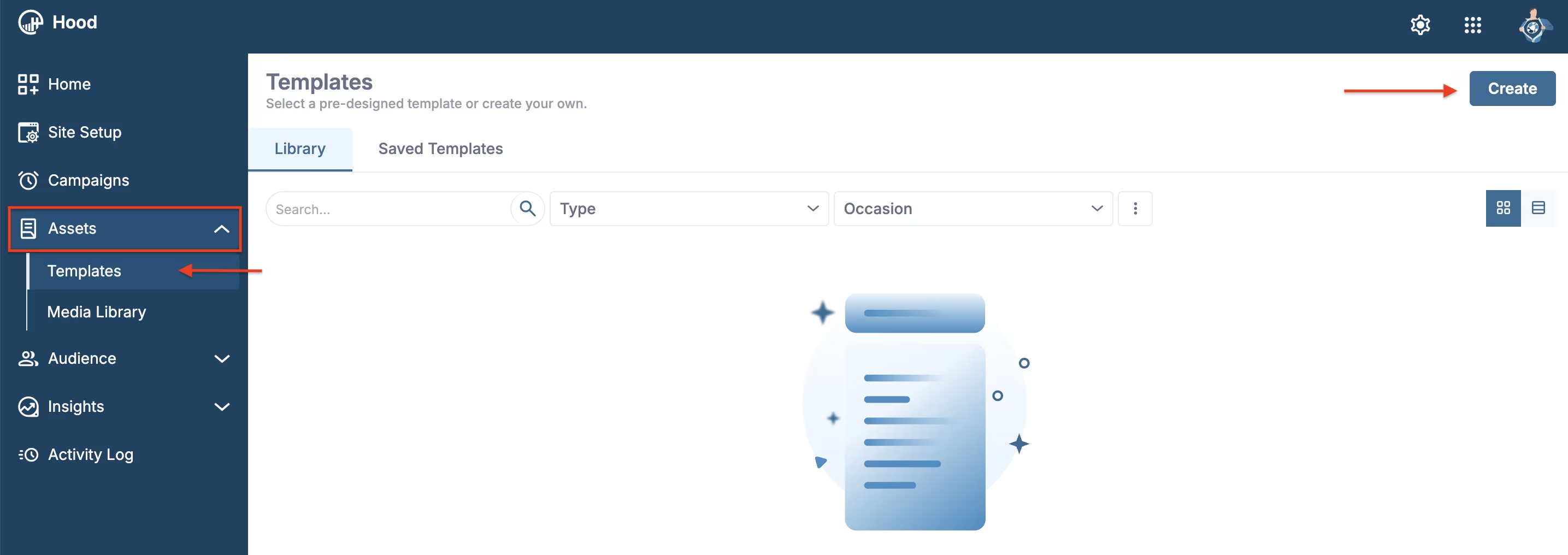
Assets > Templates location in the navigation
Once you open the Templates page, click Create in the top-right corner to start building a new template.
Clicking Create opens a selection window where you choose what you want to create: Modal, Push, Email, or SMS template.
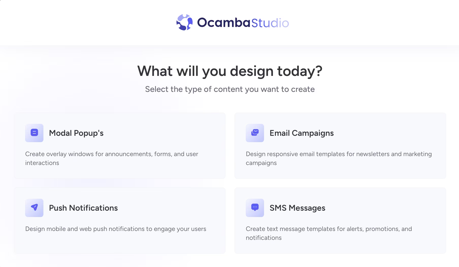
Choose a template type before entering Studio
After you choose the template type, the platform opens the Studio editor for that channel, where you can build and customize your template content, layout, and messaging details.
Using Studio keeps your messaging consistent across channels and makes it easier to prepare reusable, brand-aligned templates for future campaigns.
Creating an SMS template
When you choose SMS in the template type selector, Studio opens the SMS editor where you can compose and preview your message before publishing.
In the SMS Studio view, you can:
- Set the template name (for example, Welcome SMS);
- Write message content in the SMS Template Settings panel;
- Preview how the SMS appears on a mobile device mockup in real time;
- Monitor message length and SMS segment usage (character counter and SMS count).
In the top-right corner, Studio also provides quick controls for Undo, Redo, and language selection.
The Advanced section includes additional options:
- Generate short URL: URLs are shortened automatically. Preview only, does not affect settings.
- Optimize special character: Automatically converts non-standard characters to GSM-7 compatible equivalents to ensure maximum character count and better deliverability.
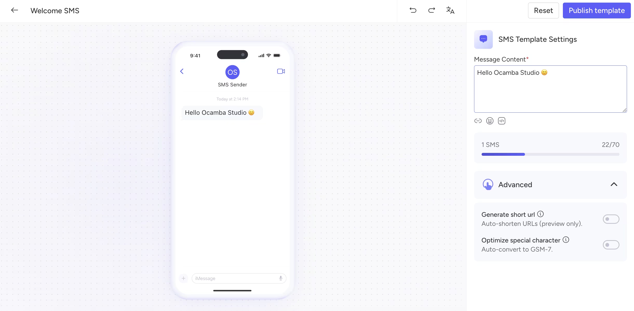
SMS template editor in Studio
When you finish editing:
- Click Publish template to save and publish the SMS template;
- Use Reset if you want to discard unsaved changes in the current editing session.
Creating a Push template
When you choose Push in the template type selector, Studio opens the Push editor with a live notification preview in the center and a settings panel on the right.
In the Push Studio view, you can:
- Set the template name;
- Add a Landing URL for notification clicks;
- Configure Content fields such as title and message body;
- Attach visual elements in the Assets section (for example, icon and hero image);
- Configure Push buttons and their target URLs;
- Preview the final notification card while editing for Windows, macOS, and Android;
- Click the eye icon to display all preview variants at the same time;
- Configure Behavior options:
- Require interaction (Desktop only) keeps the notification visible until the user interacts with it;
- Silent (Mobile only) sends the notification without sound.
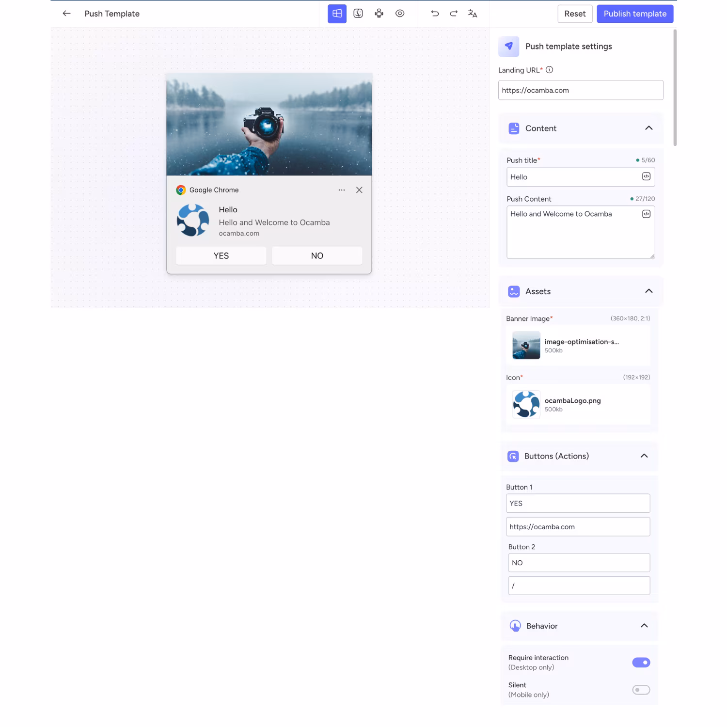
Push template editor in Studio
In the top-right corner, Studio also provides quick controls for Undo, Redo, and language selection, along with Reset and Publish template actions.
Creating a Modal template
When you choose Modal in the template type selector, Studio opens a visual editor with three main areas:
- Left panel: element library;
- Center area: modal canvas and live design preview;
- Right panel: settings and behavior controls for the selected modal.
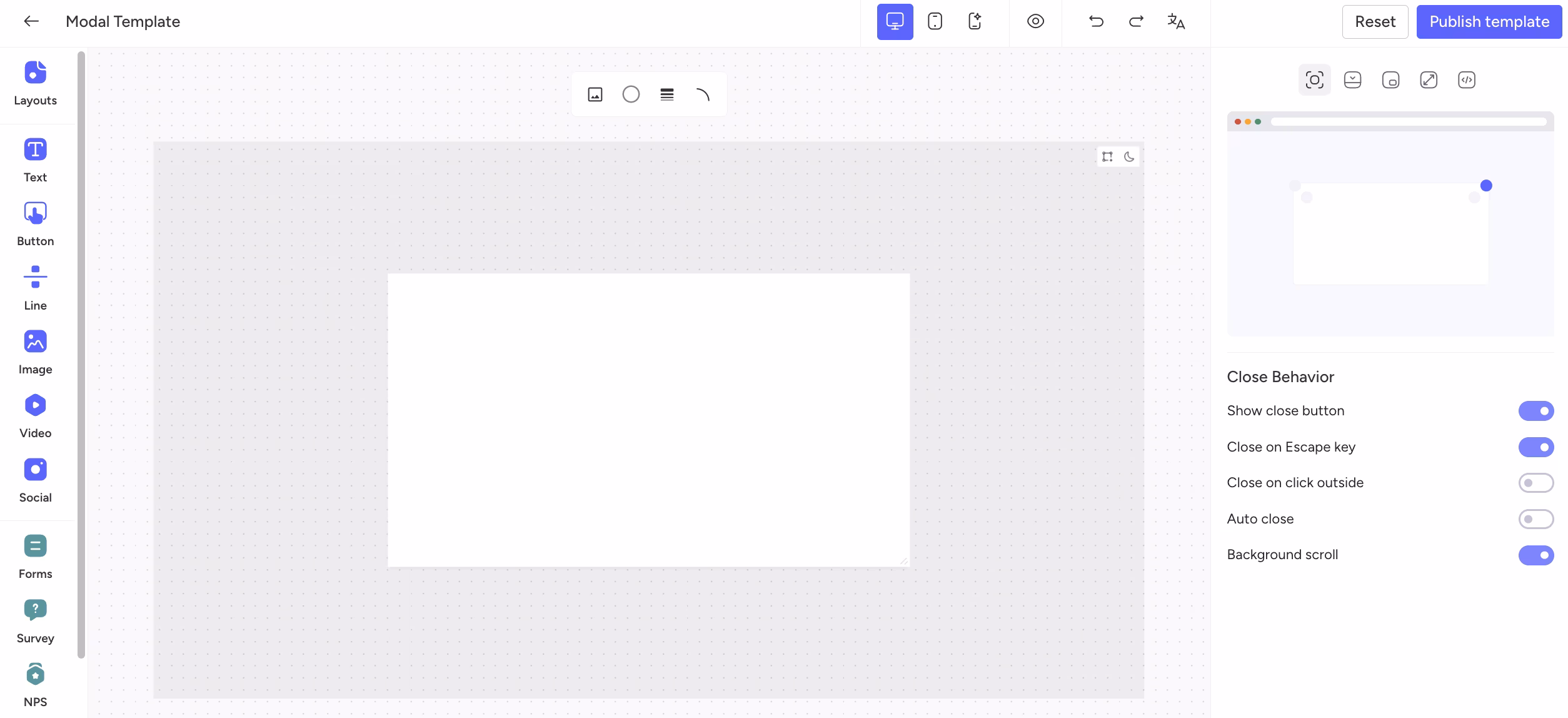
Modal Studio workspace with element library, canvas, and settings panel
The left-side element library includes:
- Layouts: Define the modal structure and spacing to organize content blocks.
- Text: Add headings, descriptions, and supporting copy.
- Button: Create clear call-to-action elements (for example, Subscribe, Learn more, Confirm).
- Line: Visually separate sections to improve readability.
- Image: Insert visual content such as product shots, banners, or illustrations.
- Video: Embed video content to explain, promote, or demonstrate.
- Social: Add social elements to support sharing and channel visibility.
- Forms: Collect user inputs directly inside the modal (Input, Textarea, Checkbox, Radio, Select).
- Survey: Build quick question flows for feedback collection.
- NPS: Capture Net Promoter Score feedback for loyalty and satisfaction tracking.
- Helpful: Collect quick helpful/not helpful feedback.
Add any element to the canvas by using drag-and-drop or by double-clicking the selected item.
Each selected element also has a General settings panel, where you can fine-tune placement and appearance.
In General settings, you can typically control:
- Alignment and positioning;
- X and Y coordinates;
- Width and height (with a lock ratio option);
- Rotation;
- Opacity;
- Spacing/alignment behavior relative to surrounding content.
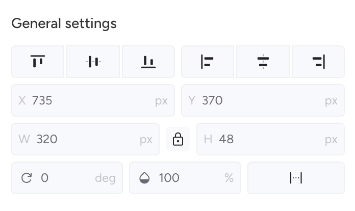
General settings for selected modal elements
In the Close Behavior section, you can control how the modal is dismissed:
- Show close button
- Close on Escape key
- Close on click outside
- Auto close
- Background scroll
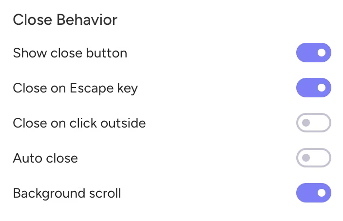
Close behavior options for modal interactions
In the same right-side panel, you can also choose how the modal is displayed on the page:
- Centered popup: Displays a popup window in the middle of the screen.
- Floating box: Positions the modal in a corner of the screen.
- Bar: Displays a bar at a screen edge (top, bottom, left, or right).
- Full screen overlay: Covers the entire page.
- Embed: Inserts content into an existing page element by using a CSS selector in the Target Element field.
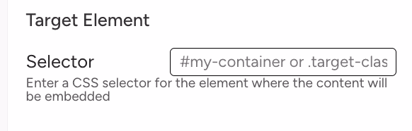
Target Element
The top toolbar in Studio also includes quick controls for:
- Device preview switching (for example, desktop and mobile view);
- A preview toggle (eye icon) to inspect how the modal will appear;
- A theme mode icon (moon) to preview how the modal adapts to the user’s browser theme (light or dark);
- A modal guideline icon to show spacing indicators while moving elements (for example, padding and empty space in pixels);
- Undo and Redo for faster iteration;
- Language selection.
While editing, you can also use Reset and Publish template actions.